This post is part of my UX Quick Wins series. Each month, I share common usability and accessibility issues on nonprofit websites and simple ways to solve them. To get these tips in your inbox, sign up for my UX Quick Wins newsletter.
I worked with a human services organization in California to help make their website easier for their primary users (caregivers) to navigate. The organization runs a program that compensates caregivers for providing in-home services to seniors.
The enrollment manager I worked with had a goal to improve the usability of their website, specifically their enrollment instructions pages. They wanted to increase the number of caregivers who came to an enrollment appointment with the required documentation and online training completed. Too many people would show up without the right docs and were forced to backtrack and reschedule, causing frustration for both the caregiver and staff.
Bad accordions cause friction
I helped the organization identify a major point of friction: the accordions on the enrollment instructions page made it difficult to see what needed to be completed in each step and which documents caregivers needed to bring with them to appointments.
Each step contained important information, so users needed to open each one to read and understand all the instructions.
That’s how accordions work – you click the heading or an icon to expand and show hidden text. They are usually toggles, meaning that you click once to reveal hidden text and click again to hide the text. Websites often have them set up so that you can only open one accordion at a time. That was the case with this website too, and that’s what made it particularly tedious to get the information you needed to complete the enrollment process.
What accordions are actually good for
Accordions work great on FAQ-type pages where users don’t need to read all the information on the page, but instead are looking for one or two answers to specific questions.
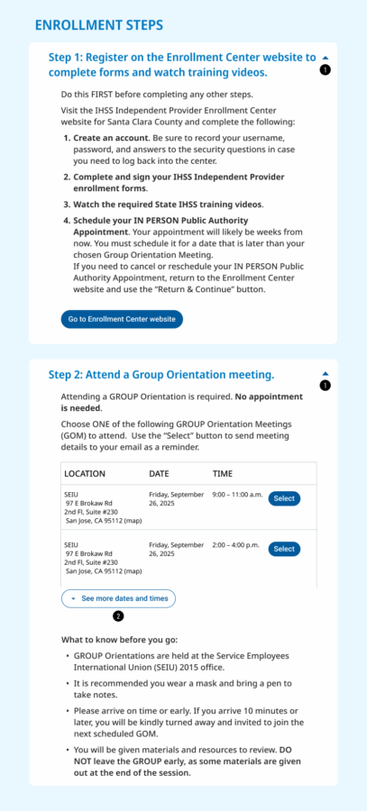
Accordions are also good for hiding secondary information that isn’t applicable to every user, but still needs to be available on the page (1). Those users can easily click to open the accordion to expose the information, but everyone else can ignore it.
Ineffective accordions increase friction & confusion
In this case, the organization needed to convey a set of steps to complete in a strict order. Caregivers must complete an online orientation session first, then attend an in-person training, and then bring paperwork from that training to a one-on-one appointment with an agency representative. The steps can’t be completed out of order.
In many cases, caregivers were showing up to one-on-one appointments—one of the last in the series of steps—without completing the prior steps or without required documents. Those appointments had to be rescheduled, causing the caregiver to waste time backtracking to address the missing steps and training, and then having to wait for another 1:1 appointment to open up.
Simple fixes to improve accordion usability
To address the problem of users not seeing all the instructions on the page, I recommended the agency make a few changes, particularly to how they were using accordions. I focused on simple changes they could make, but because I recommended changes to how the accordions functioned, they do require a web developer to implement.
Here’s what I suggested to reduce the friction introduced by poorly implemented accordions.
When used effectively, accordions can reduce clutter, allowing the user to get an overview of detailed information before diving deeper. When implemented correctly, the user has control over opening and closing sections independently of one another.
Quick win #1
Show the user all of the steps when they land on the instructions page and allow the user to control opening and closing the accordions. In the original design, opening one accordion closed all the rest automatically, which is frustrating if you need to read all the instructions (likely for both new and returning users) or if you’re looking for specific information and can’t remember which step it’s in.
Smaller design changes will help users know that they can control how the accordions work:
- use a caret icon (^) to indicate to users that a heading can be opened and closed (2)
- the caret icon should change direction to indicate whether the accordion is open or closed (2)
In the original design, the accordion icon disappeared completely when the step was opened, leaving no indicator that the heading was still clickable – yikes!
Quick win #2
The amount of information in Step 2 of the instructions lent itself well to using an accordion to reduce clutter. By showing a condensed version of the training calendar, users get an overview before opening the accordion to see additional meeting times. This layout also keeps the important notes about meeting attendance visible, while still giving the user access to the full schedule with just a click.
In the original design, the training calendar was so long, it easily overwhelmed the rest of the information on the page, making it difficult to find the next step.
Eliminating website friction increases impact
By implementing these UX quick wins and using accordions strategically, caregivers are more likely to get the information they need and complete the enrollment process successfully.
For the human services organization I worked with, improving the usability of the caregiver website ensured more caregivers were arriving to their appointments prepared with the required docs, so they could be compensated for the critical caregiving services they provide to seniors in their communities. A win for everyone.
Further reading
(1) Huei-Hsin Wang, Accordions on Desktop: When and How to Use, Nielsen Norman Group, 2023.
(2) Page Laubheimer and Raluca Budiu, Accordion Icons: Which Signifiers Work Best?, Nielsen Norman Group, 2020.