This post is part of the UX Quick Wins series. Each month, I share common usability and accessibility issues on nonprofit websites and simple ways to solve them. To get these tips by email, sign up for my UX Quick Wins newsletter.
UX Issue:
Your homepage doesn’t explain how donations are used.
Why it’s a problem:
60% of donors* look for information about how their donation will be used before donating.
Your homepage and other top-level pages are prime locations for this crucial information because their job is to help build trust and credibility with your supporters.
By anticipating what your supporters want to know before donating and providing answers on your homepage and other high-traffic pages on your website, you’ll build trust and establish credibility with website visitors early on.
If you only provide this information on your donation page, it’s a missed opportunity! By the time a website visitor sees your donation page they’ve already decided to donate, so you’re preaching to the choir at that point.
How to solve it:
You need to tell visitors how you use donations before they click “donate now” – that’s how you’ll help them make the decision to donate. So you need to include it in an easy-to-find location, one they are likely to visit before they launch the donation process, like your homepage and other high-traffic pages on your website.
Adding simple, plain-language messaging to your homepage about how you use donations will help build trust with the 60% of donors* who look for that information before donating. A visual element like a chart or graphic also works.
Here are 3 examples of quick and simple ways to include this crucial information about donation use on your homepage and other high-traffic pages on your website.
*According to Nielsen Norman’s 2017 report, Attracting Donors and Volunteers to Nonprofit and Charity Websites.
Solution #1 – Add plain-language text to your homepage
Adding one sentence to your home page, using plain-language to describe how you put donations to use, will help build trust with site visitors early on.
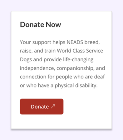
Example 1 – NEADS explains how they use donations in clear, succinct language on their homepage.
Solution #2 – Add a simple visual
Or you can use a visual to show at a glance how donations are used. Graphics works especially well when used in combination with text, as you’ll see in both examples below.
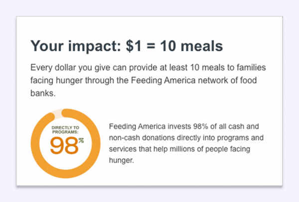
Example 2 – Feeding America includes text and a graphic on their donation page, showing the percentage of donations that goes directly to support programs. This would be a good addition to their homepage.

Example 3 – Defenders of Wildlife includes their donation use information in the footer of their website so it’s visible on every page.
Solution #3 – Use an infographic to highlight program support
A graphic illustrating your programs is also a good way to show how donations are used, without necessarily showing numbers.
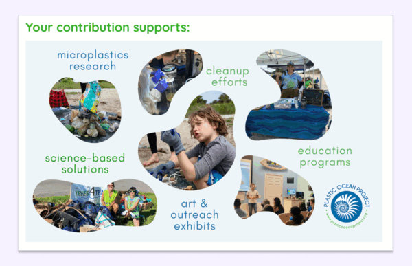
Example 4 – Plastic Ocean Project includes a graphic on their donation page showing the many programs that contributions support. Again, this visual would be a good addition to the homepage as an engaging way to show new visitors how their donations are put to use.
If you don’t have donation use information on your homepage, why not give one of these ideas a try?